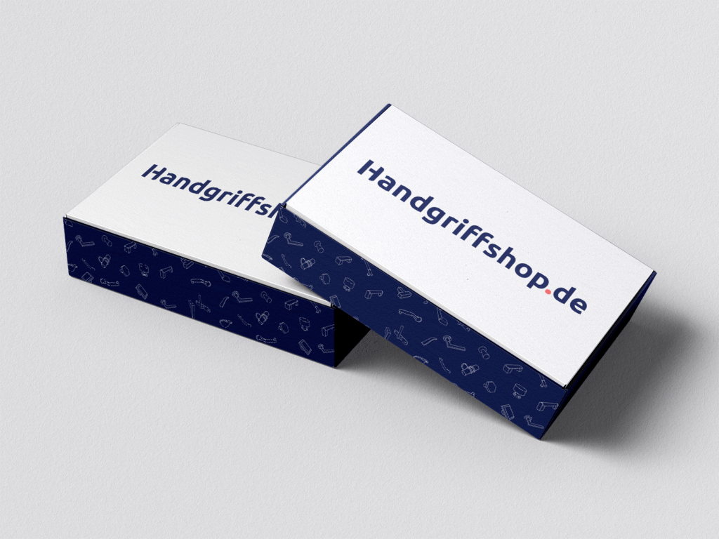
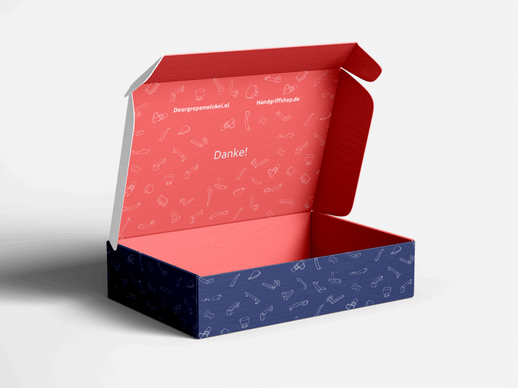
Handgriffshop was a newly established German door handle firm that wanted to start an online business selling luxury door hardware. The firm itself is directly owned by a Dutch well-established door handle firm with an expansive web presence. While this German firm would be independent, it has to look like the Dutch parent firm to ensure consistency between both markets.
The client approached me to:
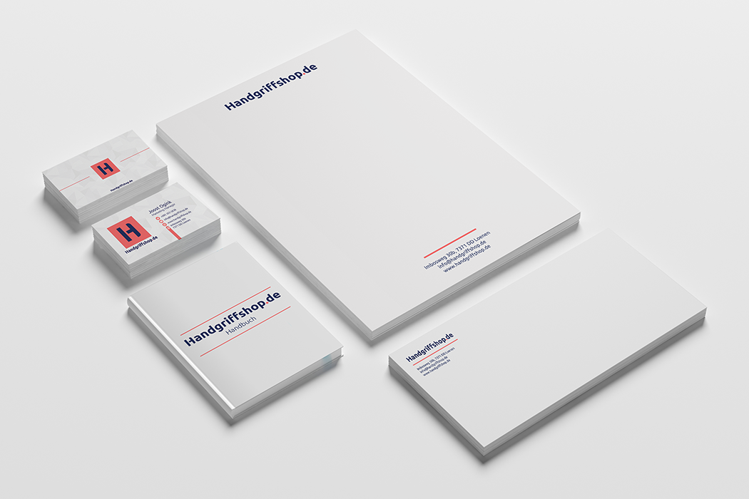
Design a brand system and logo for the new German business.
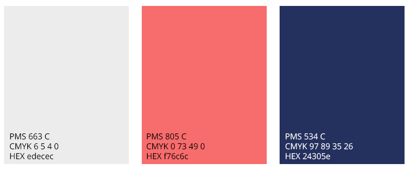
Ensure that the visual language adhered to the colors and tone used in the existing Dutch site.
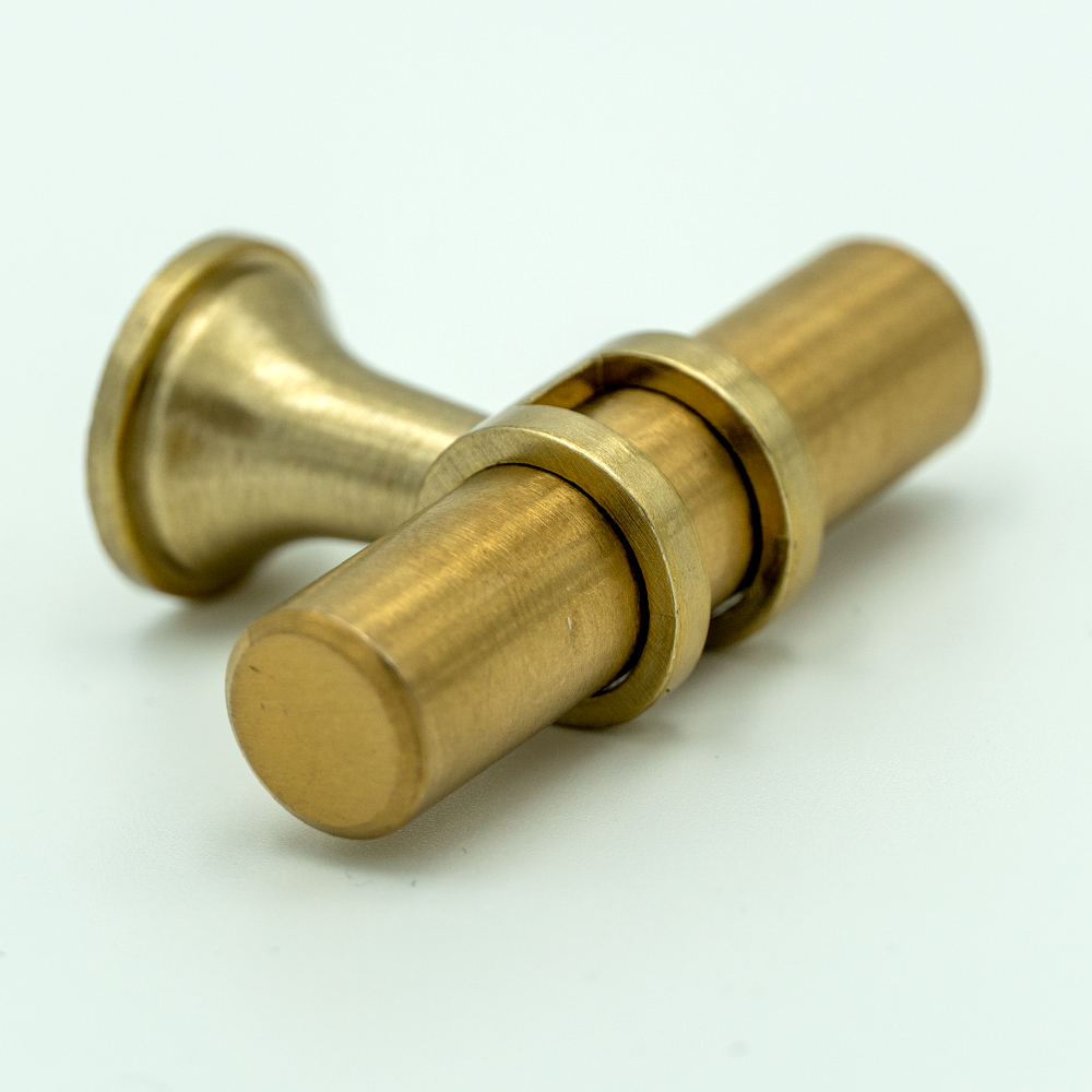
Take product photographs to be used on the website for better customer clarity and interaction.
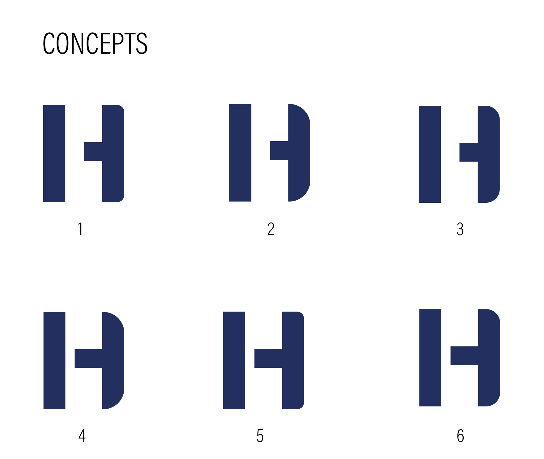
Concept Development
The “H” was designed to function as both letter and handle. To makeit so:
I adjusted the horizontal bar of the “H” to resemble a handle.
The vertical stems were stylized to evoke the knob of a door.
Proportions were carefully balanced so the “H” maintained legibility while also working abstractly as a minimal icon of a handle when viewed at smaller sizes.
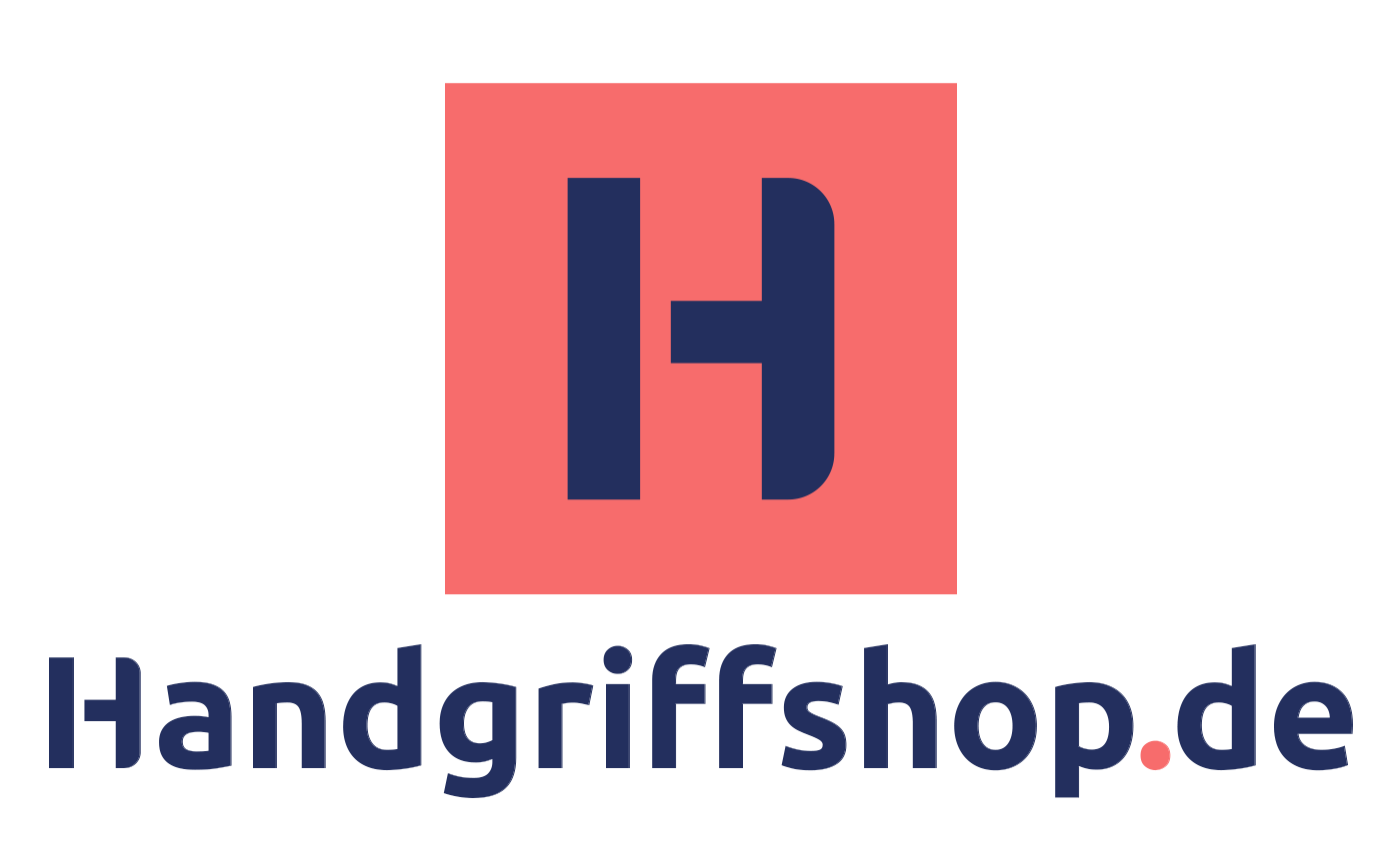
Final Logo Execution
The finalized logo presents a confident, minimalist “H” that subtly doubles as a symbol of the product itself — a door handle. It’s scalable, adaptable for both print and web, and directly ties the letterform to the core product, making it instantly recognizable.
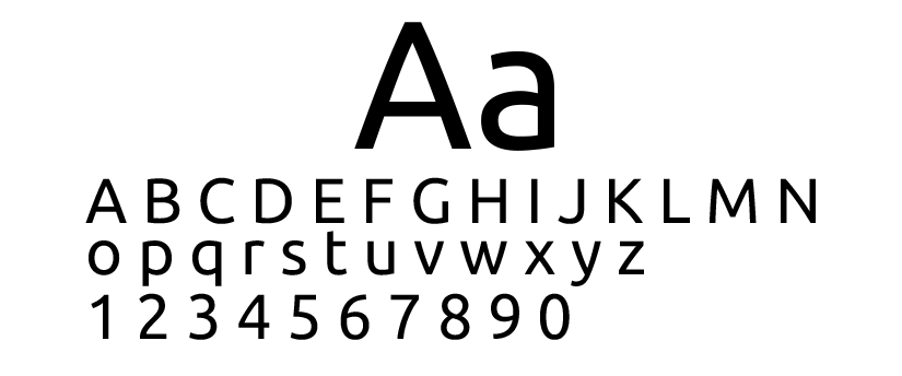
The rest of the logotype uses a modern sans-serif to maintain brand cohesion, with thoughtful spacing and weight that matches the proportions of the “H” mark.
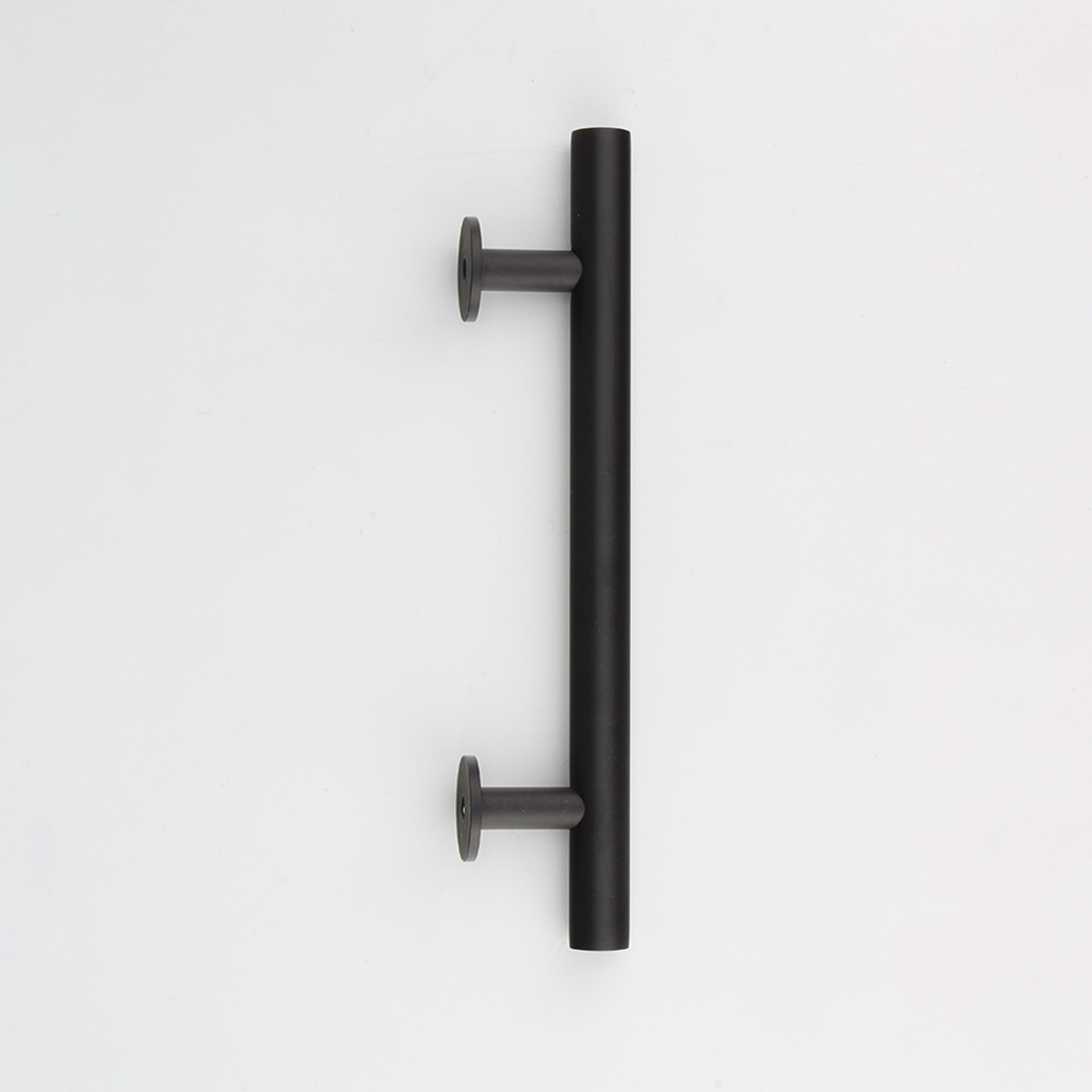
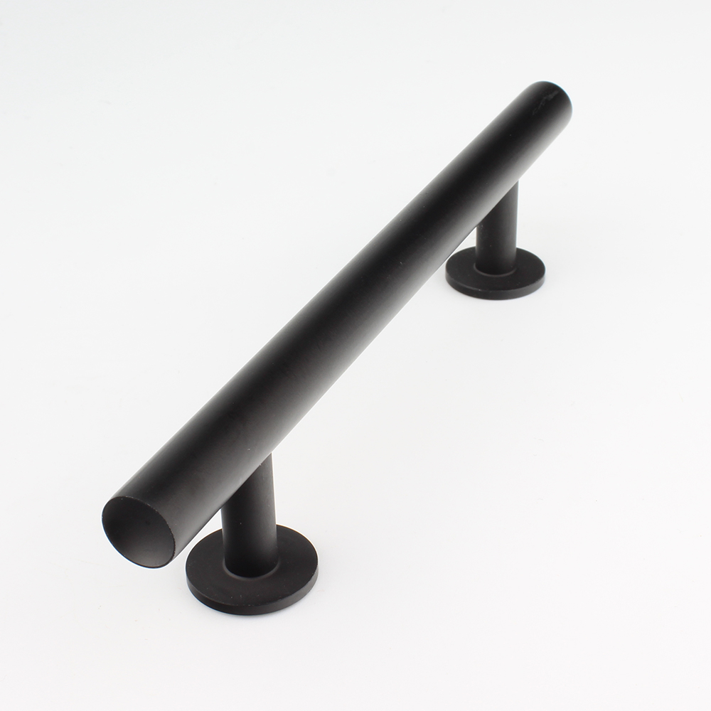
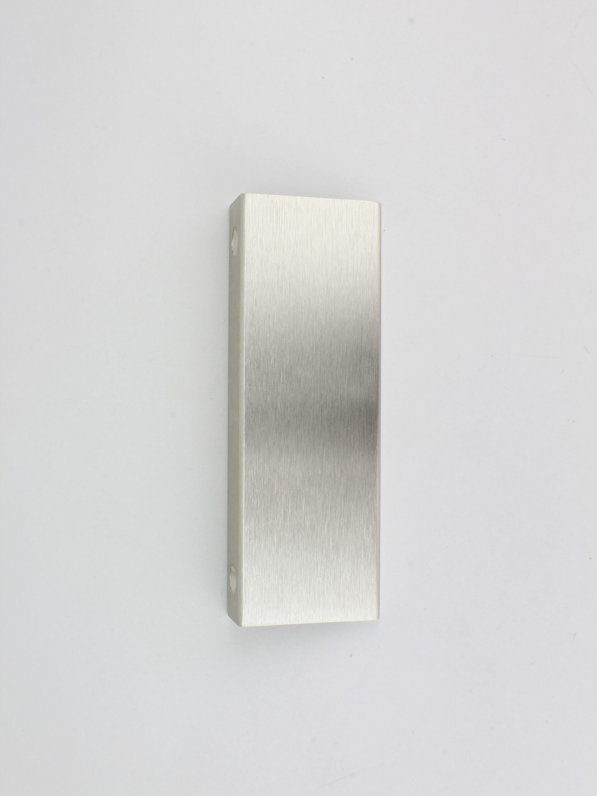
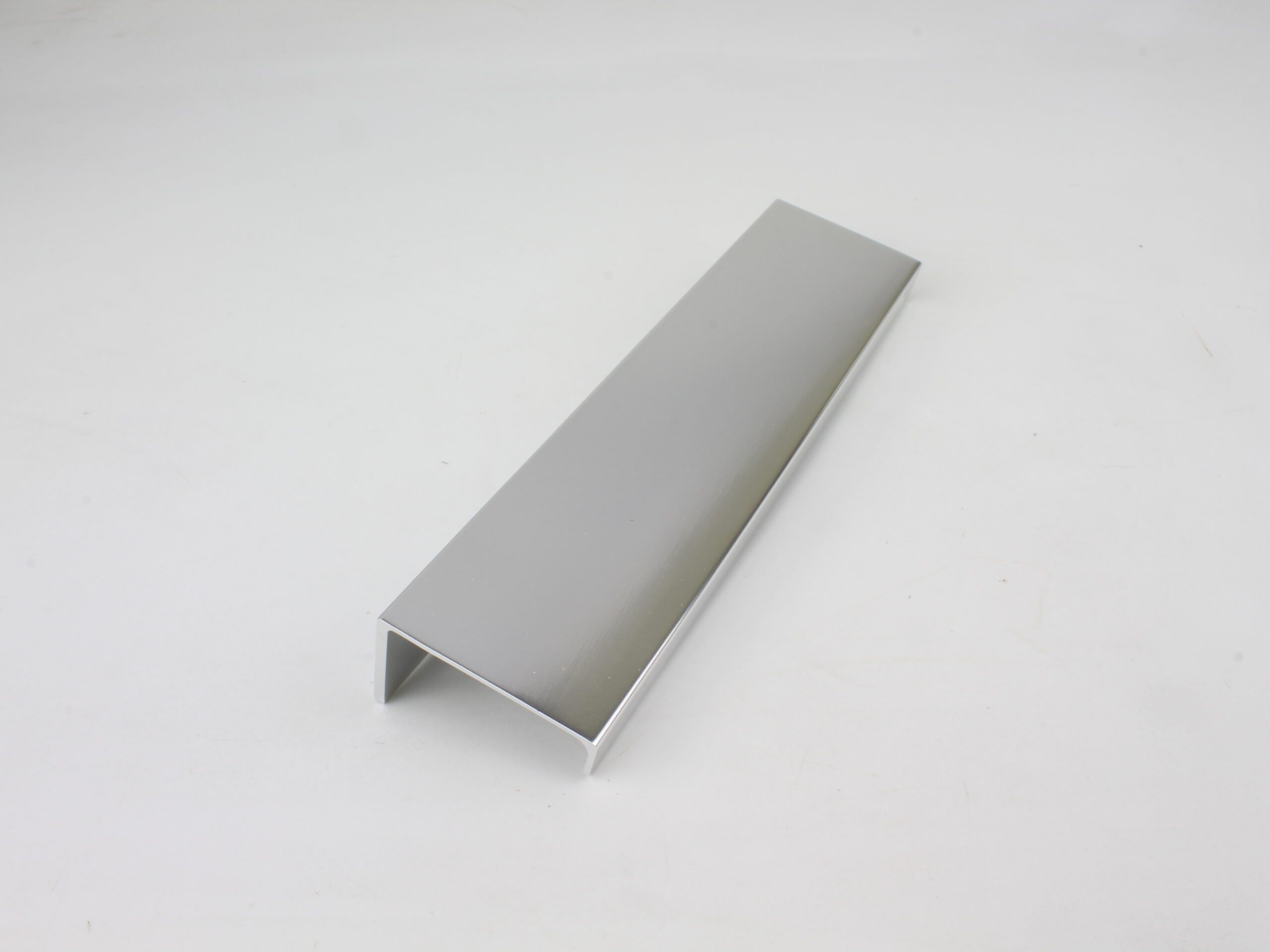
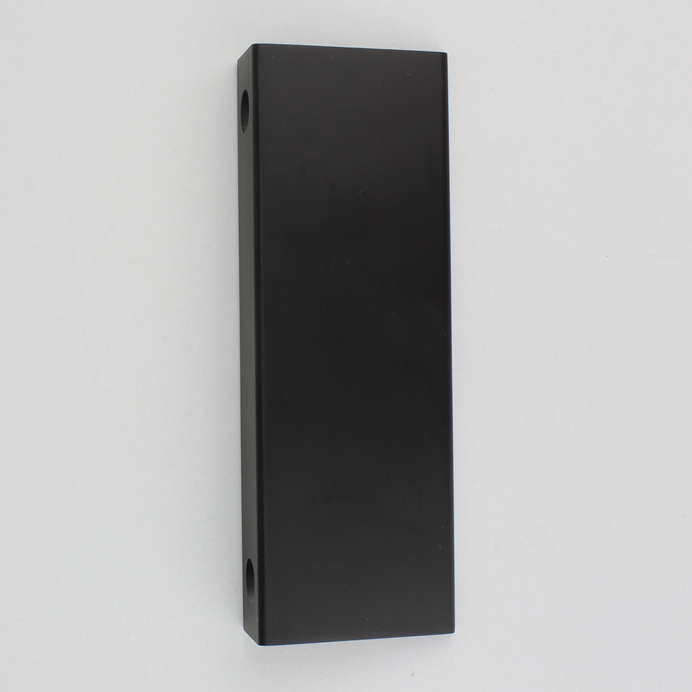
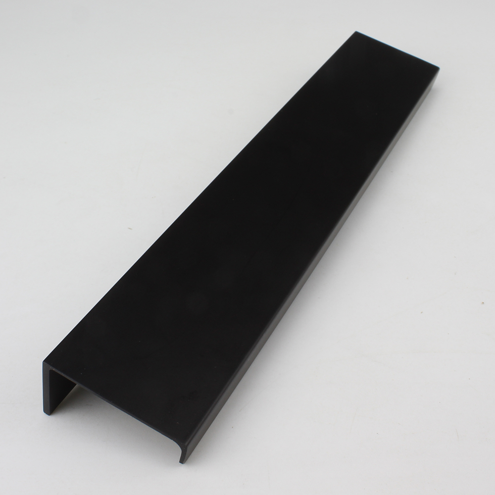
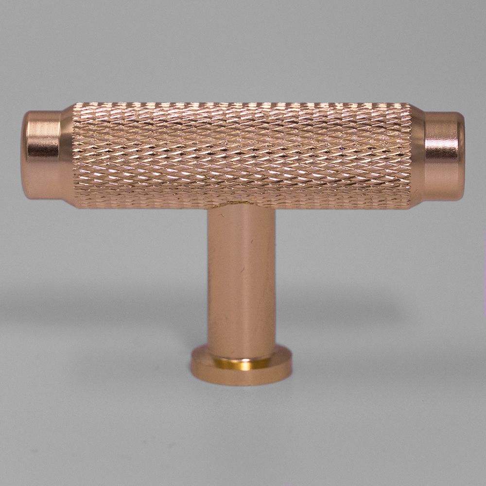
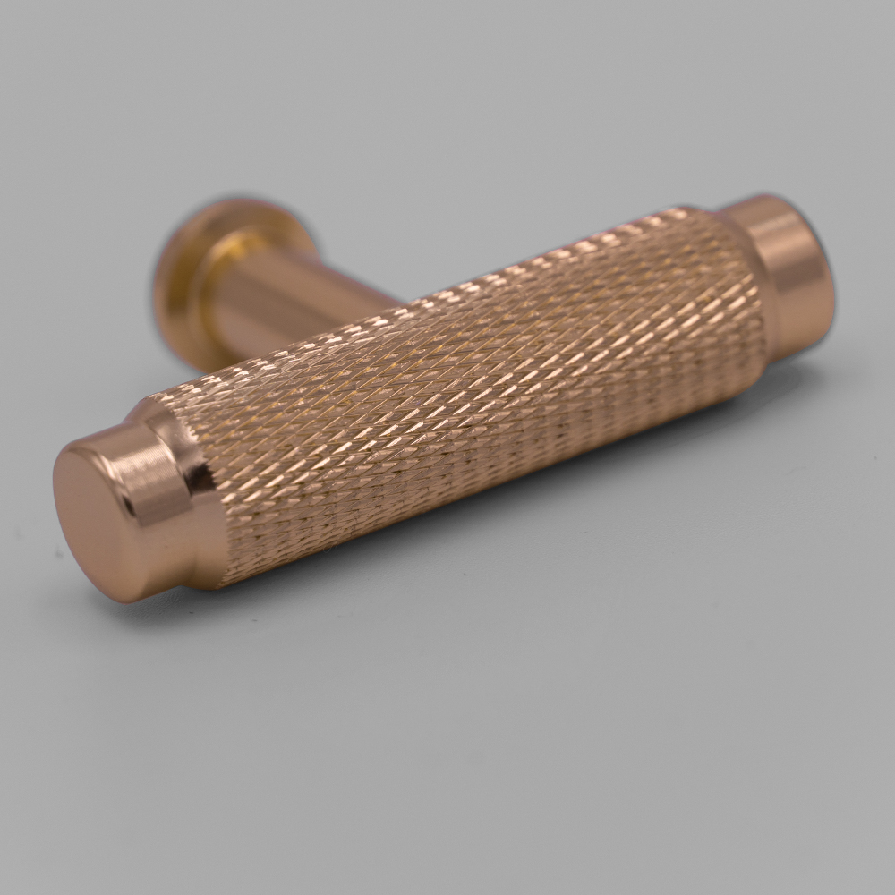
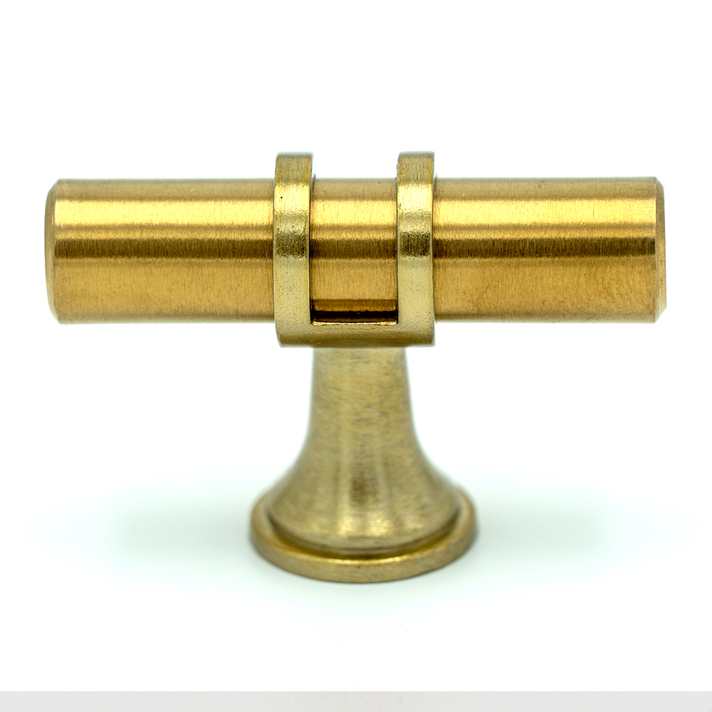
To support the launch of the Handgriffshop’s online shop, I produced a series of high-resolution product photos that capture the material quality, finish, and design details of each door handle. The goal was to create visually clean and informative images that mirror the aesthetic of Deurgreppenwinkel while standing out in the German market.
