Kapsalon Jolanda is a cozy, independent salon owned and operated by a committed stylist with over a decade of experience. Thesalon is situated in a quiet neighborhoodandoffers a friendly, personalized experience where clients feel genuinely cared for.
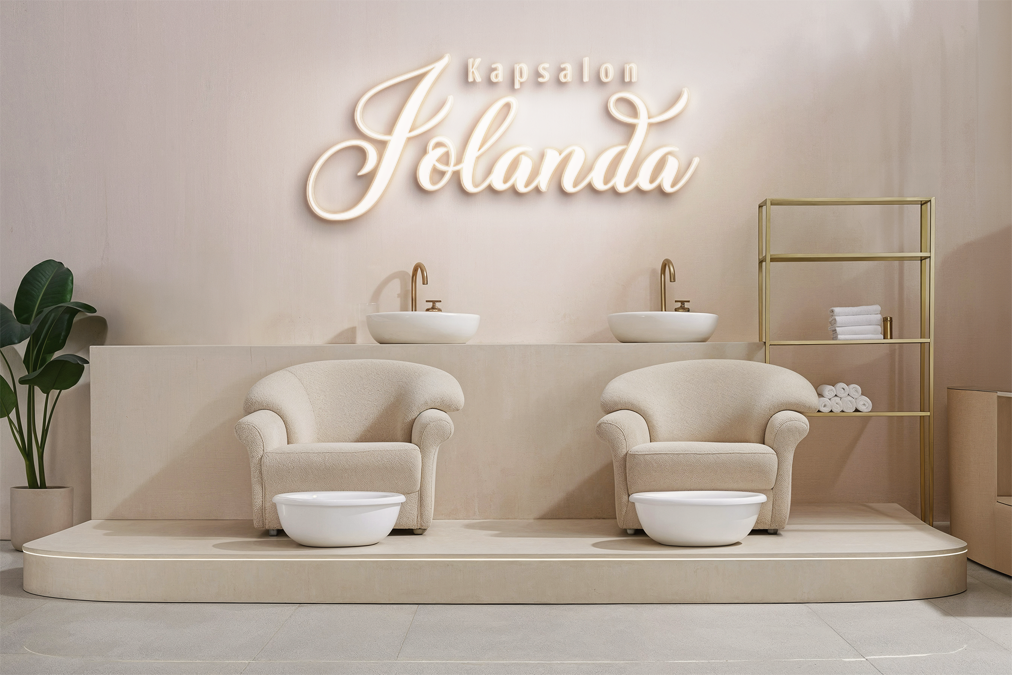
Emphasizingnatural color, low-maintenance cuts, and wholistichair care, Kapsalon Jolanda blends modern techniques with a low–keyaesthetic. The salonitself is tastefullyfittedout with soft lighting, earth tones, and handmade elements—reflecting the owner‘s belief that beauty hastobe effortless, honest, and restorative.
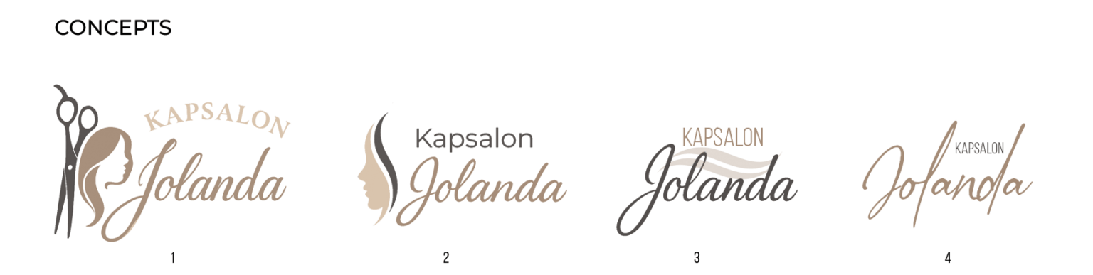
The owner reached out to me requestinga complete overhaul of her salon‘s branding. While she had previously used a basic logo and do-it-yourself design elements, they no longer reflected the style or professionalism that she had built in her business. She felt that the old look was too outdated and oppositethe warm, modern look of the salon itself. She required something clean, elegant, and distinctive—a logo that would better represent her boutique, one-woman status and resonate with her loyal, design-conscious clientele.
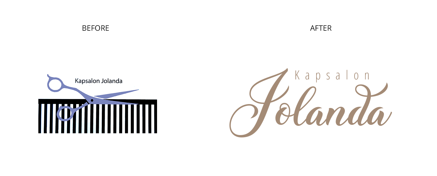
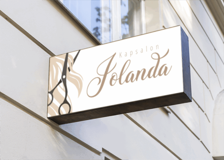
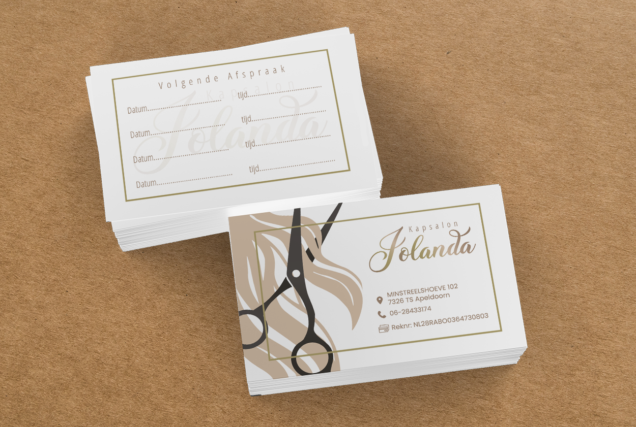
The old logo featured a literal representation of scissors and a comb, aswellas a bland,uninteresting typeface that felt dated. The new logo ismore refined and classyin its execution, using a script font with fluid lines to convey the salon’s personal, boutique nature. The streamlineddesign and removal of literal icons allow the brand to conveyafresher,higher-endsensibility.
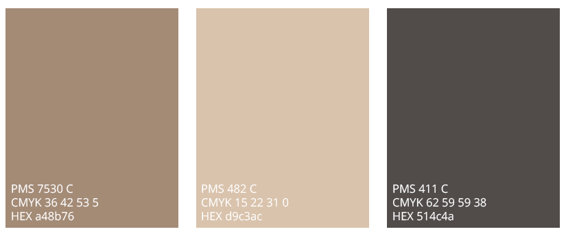
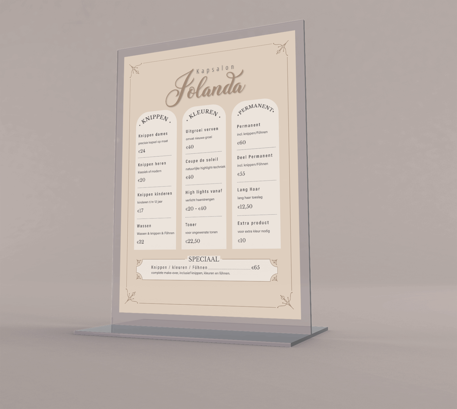
The revised color scheme features warm softneutrals that were chosen to reflect natural huespopularin hair color. Thecolorsgivethe brand a sense of warmth, calmness, and approachability.
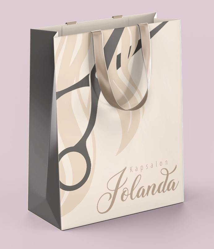
The secondary logo integrates the primary logotype with asecondary graphic element for visual storytelling. This version of the logo is ideal for marketing materials, signage, or social media, where a more illustrative, attention–getting mark is necessary without sacrificing the brand‘s sophisticated identity.
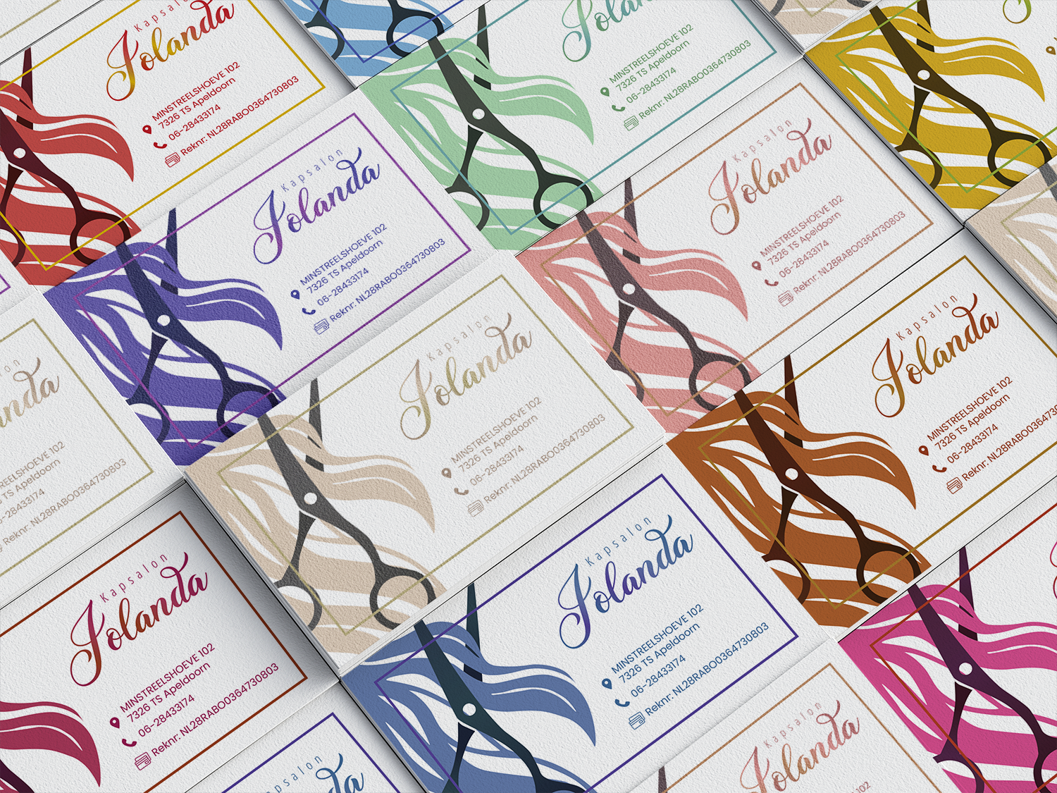
To add a playful and personalized touch to the branding, we introduced a unique idea: appointment cards in a variety of hair color themes.
The variation in colors brings visual interest and allows for seasonal or stylist-preference customization, all while keeping the layout and branding consistent.